Building the Air Quality Index Charts
Why Air Quality Index Charts?
Living in a city which is notorious for its air pollution, I certainly care about the environment, especially the air quality. Luckily the air is so clean these days, and it made me wonder what’s the chance of seeing a blue sky like this through out one year.
Here is the link of the block.
Data Acquisition
Before I delved into data acquisition, I already knew that it would be difficult to find adequate or accurate data since the monitoring and measurement of air quality in Beijing has been controversial for a while. Besides, related government departments just started to record AQI (or make it public at least), so there is not much historical data.
For example, this site offers detailed hourly AQI data publicly but it doesn’t provide historical data, as described in its documents: if you want historical data, you’d have to scrape it on your own. This is a bummer for sure. And I also looked at Forecast.io that provides API to call, unfortunately it’s just weather data, not exactly what I was looking for. And a bunch of other sites only provide real time presentation like this one. Fortunately I found this site offers historical AQI data. Woohoo!
Data Filtering/Cleaning
As I mentioned in earlier posts, in reality, a significant amount of time will be spent on finding and cleaning data before starting to render charts in the browser. This one is no exception.
The first hurdle was that the earliest record is in April 2014 even it says you can select dates back in 2013. But it was still better than nothing, right? The second hurdle was: which set of monitoring site’s data should I use? There are a dozen of monitoring sites located in Beijing, Should I use them all or just one of them? Due to the outcome I had in mind, I decided to use only one site’s data, and honestly, I chose it because it has fewer missing data points. However, this could be misleading in some cases, but that’s enough to get started.
The downloaded file is in csv format, which can be opened in Excel. Despite there are a wide range of data manipulation functions in d3.js, I think it is always a good thing if you can process them in Apps such as Excel before loading them into JavaScript. For example, I use the date format function in Excel to process the date column, super quick and easy, I’d say it’s more efficient than use data functions in d3. In a word, processing data beforehand as much as you can, be it cleaning, filtering, or formatting, it will save a lot of time later.
Layouts
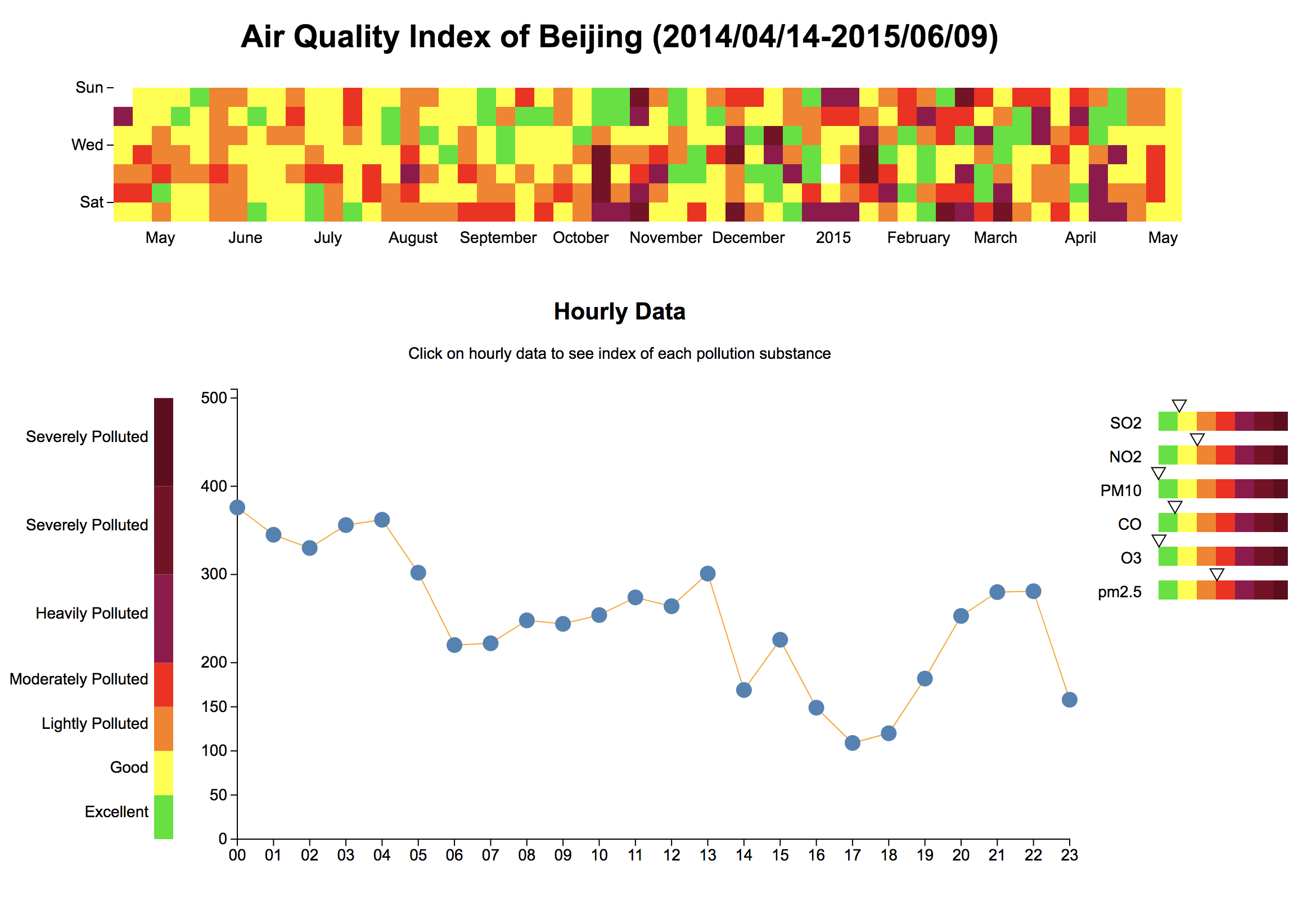
Back to where I started, I wanted to see how many days in Beijing were ‘good days’, and how bad it was on a polluted day.
I thought the calendar view type of chart is a really nice way of showing the ‘good days’ and ‘bad days’ not only because you can get a glimpse of chances of breathing clean air but also I can use colors to indicate how severe the air pollution was on a specific day.
Beyond daily indicator, I was also curious about the hourly data, I assumed that the air quality during night would be worse because factories would release pollution in midnight without supervision during day time.(It turned out to be true for more than 50% of these days). This meant that I also need a line chart/scatterplot to demonstrate hourly data in one day.
The last thing I want to know was the substances in the air, according to this official environment protection standard, the air quality index is calculated based on different pollution substances in the air including SO2, NO2, CO, O3, PM10, PM2.5. I wanted to know general status for each substance, especially PM2.5. Rather than using another line chart or bar chart. I decided to use indicator-alike thingy(not sure if there is a name for it) to show substance data.
Challenges Encountered
Daily Grid Chart
Avoid Overlap
If you look at other calendar view sort of charts, like this alternative calendar view or Days-Hours Heatmap, their timespan is either fixed or the same as a calendar. But in my case, the timespan is from 2014/04/14 to 2015/06/09, and I wanted all daily cube in one place instead of segmented into two parts(2014,2015) since complete data was not available. So I had to differentiate 2014 and 2015 so that the rects won’t overlap:
if(year(d.key) == "2014"){
  return (week(d.key) - week(new Date(2014,3,13))) * cellSize;
}else {
  return ( (52 - week(new Date(2014,3,13))) + Number(week(d.key)) ) * cellSize;
}
Scale is Tricky
In other calendar view demos, the segment of each month is the black line wrapper, but in this case, the start date is not January and the end is not December, so I thought perhaps I’d better not using the lines to ‘wrap’ each month. But then how to tell viewers which area correspondents to which month? Obviously time scale was not exactly applicable, because the rects are arranged by week number, it is not quite ‘linear’. More importantly, even if I can come up with an appropriate time scale, it won’t be accurate, for instance, May 1st is the fourth row, then does this column count as Apr or May? Based on this question, I adjusted the goal to show approximately the correspondent month area. So I tried to modify the interpolate function although not very accurate:
var days_xscale = d3.time.scale()
					.interpolate(function(a,b){
						return function(t){
							return (a+t*(b-a))/1.06;
						}
					})
					.domain([data[0].key, data[data.length-1].key])
					.range([0, daySVGWidth])
It is definitely not the best solution, but it worked somehow, and I came to realize how interesting customized interpolate function can be.
Line/Scatterplot Chart
Line chart and scatterplot chart are not new, although three things worth noting are:
Selection Update
To be honest, I didn’t realize the importance of selection update other than transition effect until I used real life dataset in this demo. The key take away is, real life data cannot be perfect, there will be missing data points or event redundant data points sometimes. Using key function in selection.data can be very handy to handle update selection, enter selection, and exit selection:
selectedHour.enter()
          .append("circle")
          .attr({
            "cx": function(d){
              return xScale(hourParser(d.TIME))
            },
            "cy": function(d){
              return yScale(+d.AQI);
            },
            "r":6
          })
          .attr("class","dot");

selectedHour.transition()
.duration(1000)
.attr({
  "cx": function(d){
    return xScale(hourParser(d.TIME))
  },
  "cy": function(d){
    return yScale(+d.AQI);
  }
});

selectedHour.exit().transition().remove();
Hover on the circle
Another interesting thing is the click event, but I am not gonna talk about the event listener. Say you’ve bind mouseenter listener to circles with fill:none;stroke:blue;stroke-width:2px attributes, but nothing happened when you hover on the circle unless the mouse points to the edge of the circle, the blue line, because the fill is none, and you were not hovering the circle technically.
Color Scale Next to Y Axis
The typical legends for heatmap is like the one in this chart. In my case, I need this set of legends to help explain not only the daily grid chart but also the line chart, and the indicator chart. So I thought why not place the color legends next to the Y axis with their length corresponding to the y scale, in that way, viewers can spend less time to decode the meaning of each color in these three charts.
Indicator Chart
The biggest problem for indicator chart is reusability. The substance index standard is different from each other, thus different scales, but other than that, the rest of settings are the same. It would save a lot of time if the rest of settings are reusable. And generally speaking, reusable components in d3 charts are quite interesting, there are some tools and libraries, such as dc.js or this d3kit from twitter.
Things to Improve
From the perspective of source data utilization, I would love to use more data from different monitoring site, or place them on a map. Furthermore, I think it would be a good idea to run some scripts to automatically collect relevant data so the visualization can be more up-to-date.
From the perspective of code itself, the improvement I want to do the most is reusability for sure.
Recap
To recap, 1) data in reality cannot be readily available or perfect, you’ll spend a lot time on data acquisition, data cleaning. 2) before you actually start to write d3 code, think through what kind of presentation you need 3) reusability is crucial.